Brand Guide · v1 · November 2026

TurnKeySpa brand guide.

How the TurnKeySpa name, logo, color, type and voice are used. Everything here comes from what's on turnkeyspa.com today.

Download logo files

01 · Name

Name usage

Always: TurnKeySpa

TurnKeySpa is the only form of the name. Write it as one word with a capital T, K and S, matching the logo wordmark. Use it in sentences, headings, titles, alt text, emails and documents.

Never

  • No space between "TurnKey" and "Spa"
  • No lowercase k or s
  • No all-caps (except inside the logo tagline)
  • No "TKS" outside internal shorthand
Name standard

The text name and the logo now match. The wordmark reads "TurnKeySpa" ("TurnKey" in bold Deep Teal, "Spa" in light Teal, tagline "HEALTH SPA IN A BOX"), and every page, title, tag and footer uses the same spelling. The domain stays turnkeyspa.com (lowercase in URLs and email addresses).

Positioning

TurnKeySpa is a health spa business in a box, built, branded and boxed, then delivered to your door. That includes the sign out front, the screens at the front desk, and the systems behind them. It's proven on a real clinic, Renova. There are three packages, Essential, Pro and Signature. Every package includes branding, and each step up leaves fewer owner to-dos.

Pricing stays out of this guide on purpose. It's quoted in the private client view and the proposal.

03 · Color

Color palette

The site uses CSS custom properties in /style.css, and the logo has its own colors.

Ink#0B0E26 · --ink
Primary background
Midnight#171D47 · --mid
Cards, surfaces
Studio#273152 · --studio
Secondary surface
Gold#D9B26A · --gold
Accent, CTAs, eyebrows
White#FFFFFF
Headings, body text
Mist#A9B3D1 · --mute
Secondary text
Logo Teal#0F8B8D
Logo only
Logo Deep Teal#164E63
Logo, logo field

Utility: #FF8F8F marks negative values in proposal tables.

Contrast (WCAG 2.x)

PairRatioUse
White on Ink19.0:1AAA · all text
Gold on Ink / Ink on Gold9.5:1AAA · buttons, accents
Mist on Ink9.1:1AAA · body copy
Mist on Midnight7.7:1AAA · card copy
White on Studio12.8:1AAA
Deep Teal on White9.1:1AAA
Teal on White4.1:1Large text / graphics only
Teal on Ink4.6:1Avoid for logo use
Note

The website UI is navy and gold, while the logo is teal. The teal shows up only in the color logo. On the site, the logo always appears reversed in white. Use teal for logo and print collateral. Don't introduce it as a UI color without a decision.

04 · Typography

Typography

The site loads no web fonts. It uses the system UI stack, so pages are fast and look native on every device.

font-family: system-ui, "Segoe UI", Roboto, sans-serif · base 17px / 1.55 · antialiased

H1 · 800 · clamp(40px, 7.4vw, 92px) · -0.02em · lh 1.05Your spa, built.
H2 · 800 · clamp(32px, 5vw, 60px) · -0.02emIt shows up at your door.
Lead · 400 · clamp(17px, 1.6vw, 21px) · MistEverything your new location needs arrives ready to go.
Body · 400 · 17px / 1.55We do the work. You see clients.
Eyebrow · 700 · 12px · 0.18em · UPPERCASE · GoldWhat's in the box
Button · 800 · 14–17pxGet your box ↓
Stat / big number · 900 · GoldBox #2

Weights in use: 400, 600 (pills, table headers), 700 (eyebrows), 800 (headings, buttons), 900 (stats, text logo).

05 · Voice & tone

Voice & tone

Warm, clear, experience-driven, plain language. Short sentences. Speak to the owner about their first day, not about our process.

From the site

Your spa, built, branded and boxed.
Open it. It's already working.
We do the work. You see clients.
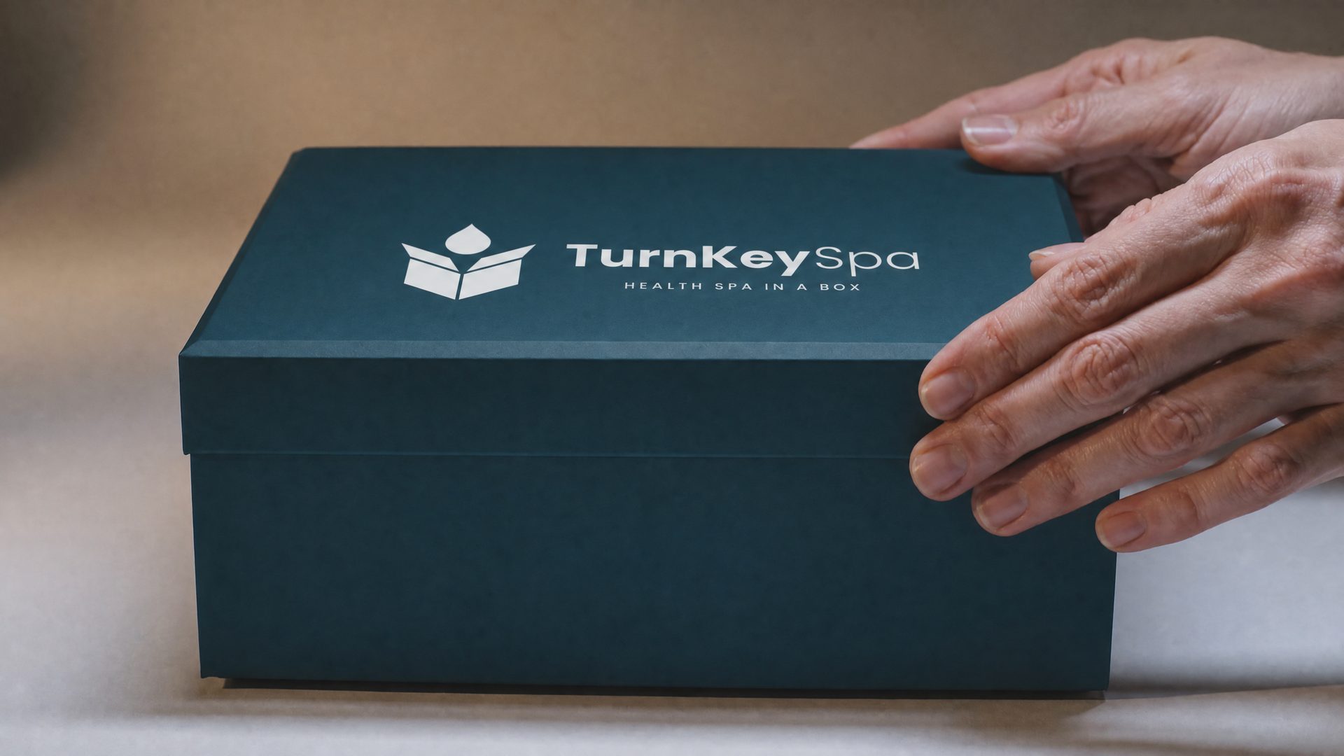
One box. Your brand on the lid. Everything inside already chosen, configured and tested, so day one feels like day one hundred.

Principles

  • Warm: "you" and "your spa", with the owner as the hero.
  • Clear: say what arrives and what's left to do.
  • Experience-driven: describe moments like opening the doors or welcoming the first client.
  • Plain: no jargon, hype or unproven claims. Back up proof ("Proven on a real clinic: Renova").
  • The box metaphor carries the story: the box, inside the box, Box #2.
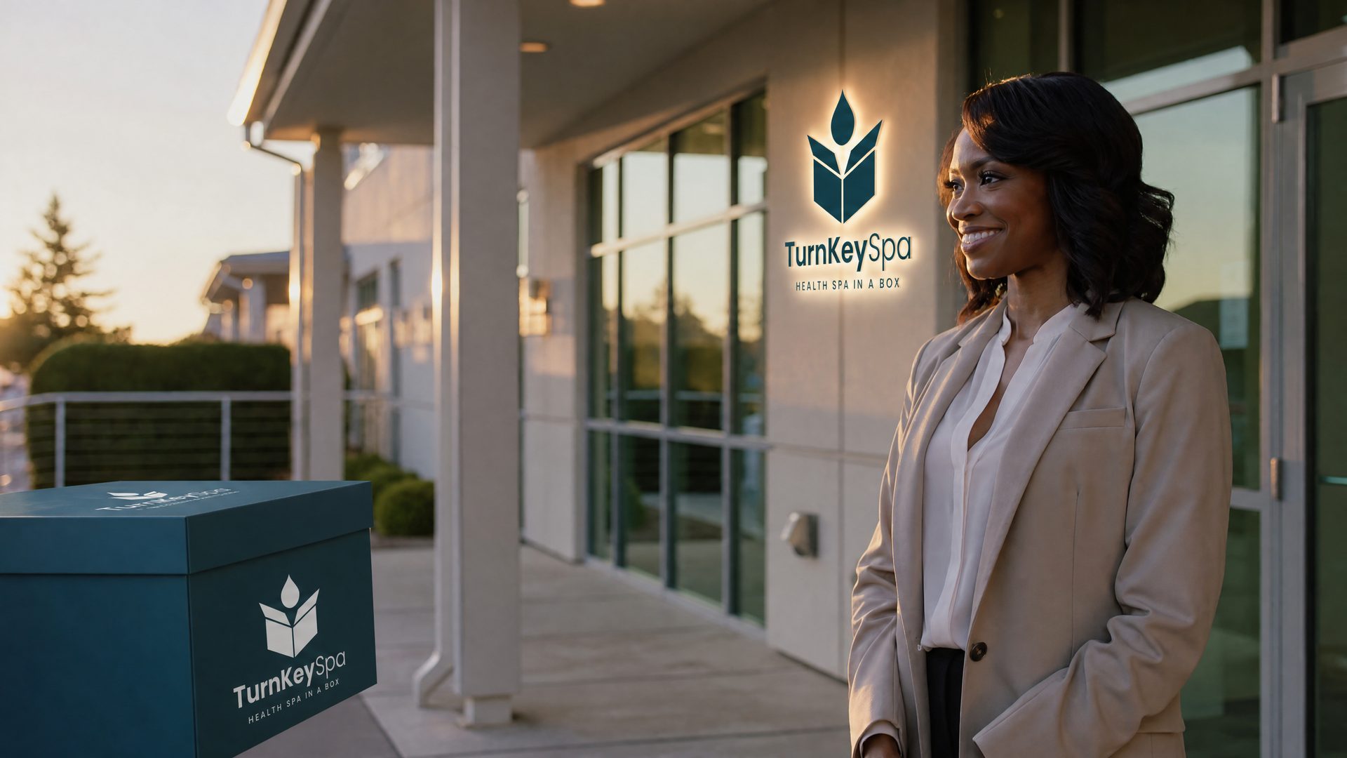
06 · Imagery

Imagery style

07 · UI elements

Buttons & cards

Primary: Gold fill, Ink text, weight 800, pill (999px radius), 16×28 padding, lifts 2px with a gold glow on hover. Ghost: transparent with a 25% white border.

Card

Midnight fill, 7% white border, 20px radius, 22px padding.

Featured card

Gold border and a soft gold glow to highlight one option.

Layout

Max width 1160px, 22px gutters, 110px section padding. Easing cubic-bezier(.22,1,.36,1).

08 · Download

Logo files

SVG logos (horizontal, stacked, icon, color and reversed) plus PNG favicons and OG image.

Download ZIP horizontal.svg